That is one of the claims Goddard makes in his 2012 Global Warming Report Card. I have already looked at all his 19 points but some are worth examining in more detail, if only because he has emailed me in an accusery tone saying how I ‘compulsively focused on two of them’.
As stated I did a whole post on all of them and found them all to be lacking, but the ‘two’ are his cherry picked claims about cooling in Greenland, that were taken apart by error in the original post. But worse, this ‘report card’ without correct of an error Goddard admits to, is now being made widely available through that great scientific bastion of truth the ‘Science & Public Policy Institute’, (SPPI), in downloadable PDF form claiming;
“The massive bulk of evidence indicates that nothing is wrong, and that Hansen, Mann and the rest of the hockey team are not being honest with us.”I have emailed ‘bferguson’ from the 'Contact' information at SPPI, and asked if it will be corrected. Several days and no reply. So who is ‘not being honest with us’?
So now it is time to compulsively focus on a third
The claim that ‘Sea level has been declining for several years, and is lower now than it was in 2003’ is supported by a graph of unadjusted sea level data from Envisat and a link to that data.
I have used Excel to reconstruct Goddard’s graph so that I can look more sceptically at his claims. A trend line clearly shows that even over such a short time period the trend is definitely up.
Goddard’s first claim, that sea level has been declining for several years, looks like a straight forward lie even using his own graph. I cannot not figure out anyway a mind, even Goddard’s, can come to this conclusion, even by another mistake. The max sea level every year, from 2003 to 2010 has been higher than 2003. Which are the several years he believes have declined? It can only be deliberate misrepresentation.
The Envisat data set is currently so short it is difficult to tease out any really significant conclusions. But I’m sure that is precisely why Goddard favours it. The real story of sea level rise can be obtained for the same web site this data comes from, which Goddard ignores, and the overall and continuing trend is obvious for all but the closed minded to see.
As a side note, I was told with great authority on another blog that attracts 'skeptics' that sea level was now below the trend line as if this evidence was of great significance. I had to point out that it was an average trend line - it will be below it about 50% of the time!
A Cherry Picking Moment
Goddard’s claim the sea level is now lower than 2003 is the classic cherry pick. We actually know almost nothing about the sea level in 2003 as the data only represents the immediate end of that year. But I will give him some leeway and assume he means the start of 2004. It is such a classic because for the first time since the start of 2004, the peak sea level was lower in 2011, so he sort of can claim to be right - or at least right enough for most of the un-sceptical 'Skeptics' who frequent his blog.
But he isn’t actually correct, because cherry picking a single point within a noisy data set like this is a meaningless thing to do. Consider that the unadjusted data when graphed almost resembles a sine wave. It is clear that sea level fluctuates annually with highs at the start and end of the year and lows around the half year point. I wondered what the average sea level each year would be. The average of each annual fluctuation would be more meaningful than just cherry picking a high point to make an assertion and ignoring almost all of the relevant data in the process.
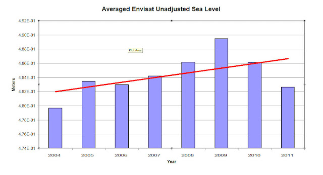
Using Excel I averaged all the annual measurements and plotted them;
So Goddard wasn’t even correct about sea level being lower than the end of 2003/start of 2004. It is clear that the average sea level for all years, including 2011 was greater than 2004, and as the trend line shows, sea level is still rising.


Yes but look, 2009, 2010 and 2011 are part of a declining trend. It's the start of a reduction in sea level and a global cooling that will show AGW as the massive confidence trick it is...
ReplyDeleteYawn.
These goons see what they want to see. Meanwhile the physics (warming and continuing influx of fresh water from melting land ice) tells us this is but a blip.
I take it you've seen Skeptical Science's graph:
http://www.skepticalscience.com/graphics.php?g=47